Salisbury Laser Clinic
Proud to work with this pioneering skin laser clinic run by the NHS in Salisbury, Wiltshire. They required an independent identity to foster growth and engender wider appeal.
Run by the NHS and located within Salisbury District hospital meant that the skin clinic could offer the highest level of knowledge and care from specialist doctors and nurses.
But conversely these circumstances meant that the clinic lacked it’s own identity and voice, and the associations a hospital can create for some people made it difficult to reach a wider range of patients.
These issues combined with increasing competiton from high street and private clinics meant that a new and more approachable identity was desperatley needed.
Solution
Access to good quantitative research from various sources revealed that a patient led approach would be a great strategy for the brand. I was able to reflect this decision by re-naming the organisation, creating a new identity, producing patient stories and building a better booking system.
Naming
Naming is a vital part of any brand strategy and names can have a big effect on the culture of an organisation. We helped to clarify the clinic’s proposition by researching options and choosing more specific and welcoming language.
Old name – Wessex Specialist Laser Centre New name – Salisbury Laser Clinic

Qualitative brand name data table
Colour palette
A harmonious colour palette that draws on patient demographics and pulls away from thoughts of clinical environments and lighting often associated with hospitals. With the patient centred approach I aimed to make everything feel human – rather than cold, clinical or impersonal.

Salisbury Laser Clinic colour palette
Type
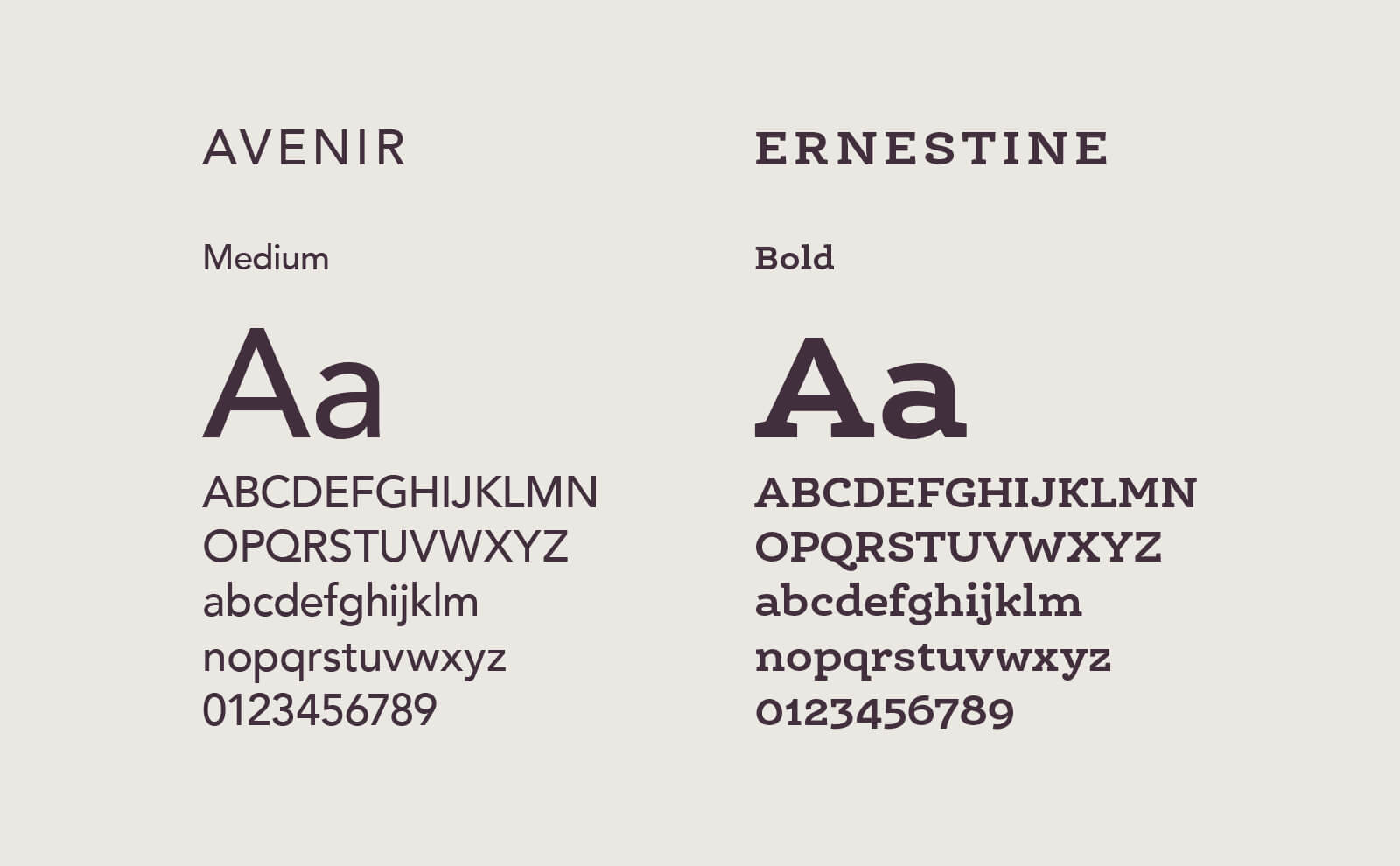
A beautiful blend of clarity and precision, balanced with the right amount of warmth and friendliness – sort of like cosy science!
Adrian Frutiger’s humanist sans Avenir is paired with Nina Stössinger’s Ernestine.

Salisbury Laser Clinic type palette
Photography
The brief was to capture candid and approachable images of current and past patients – and the results were amazing. Following the photoshoot we interviewed these patients and produced some incredible stories around their life-long challenges, and their experiences of treatment at the Salisbury Laser Clinic.

Patients
Symbol
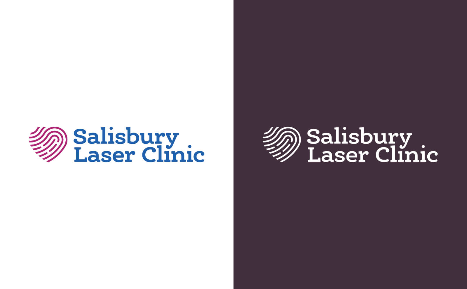
The Salisbury Laser Clinic has been transforming patients lives since 1982, and this holistic mark represents a great deal more than simply skin treatment – the symbol expresses both the love of a rewarding job and the love of one’s own skin.

Salisbury Laser Clinic symbol
Logotype
Set with Ernestine and stacked in a logical way the logotype features modified letterforms and takes advantage of the ball terminals found throughout the Ernestine font to unify the whole.

Salisbury Laser Clinic logotype

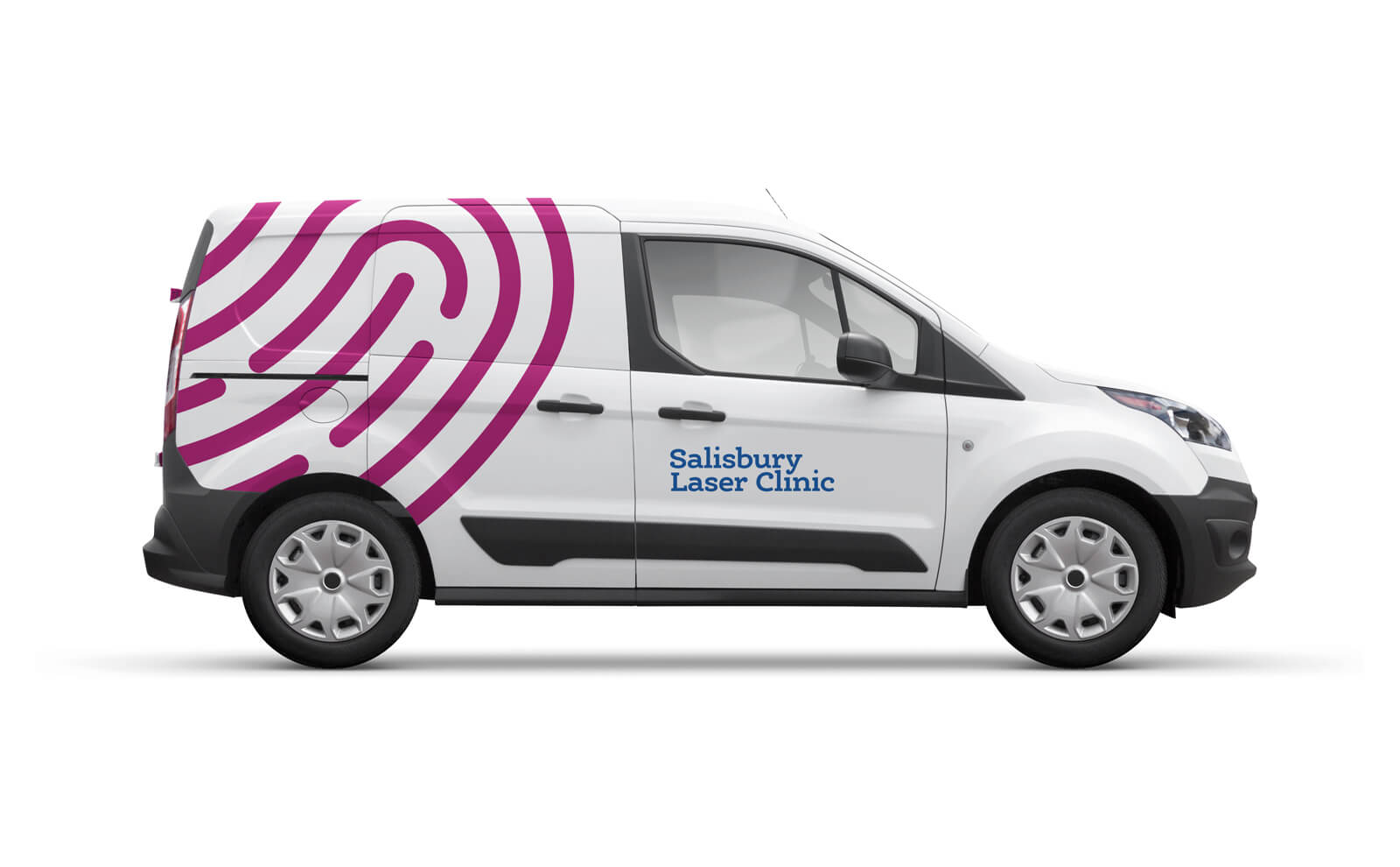
Salisbury Laser Clinic transport
Results
Upon launching their new strategy Salisbury Laser Clinic saw a 30% boost in new patients. This was fantastic, both for the patients and the NHS! 🙌
If you’d like to talk about how I might help your business, from logos to full brand identities get in touch.